
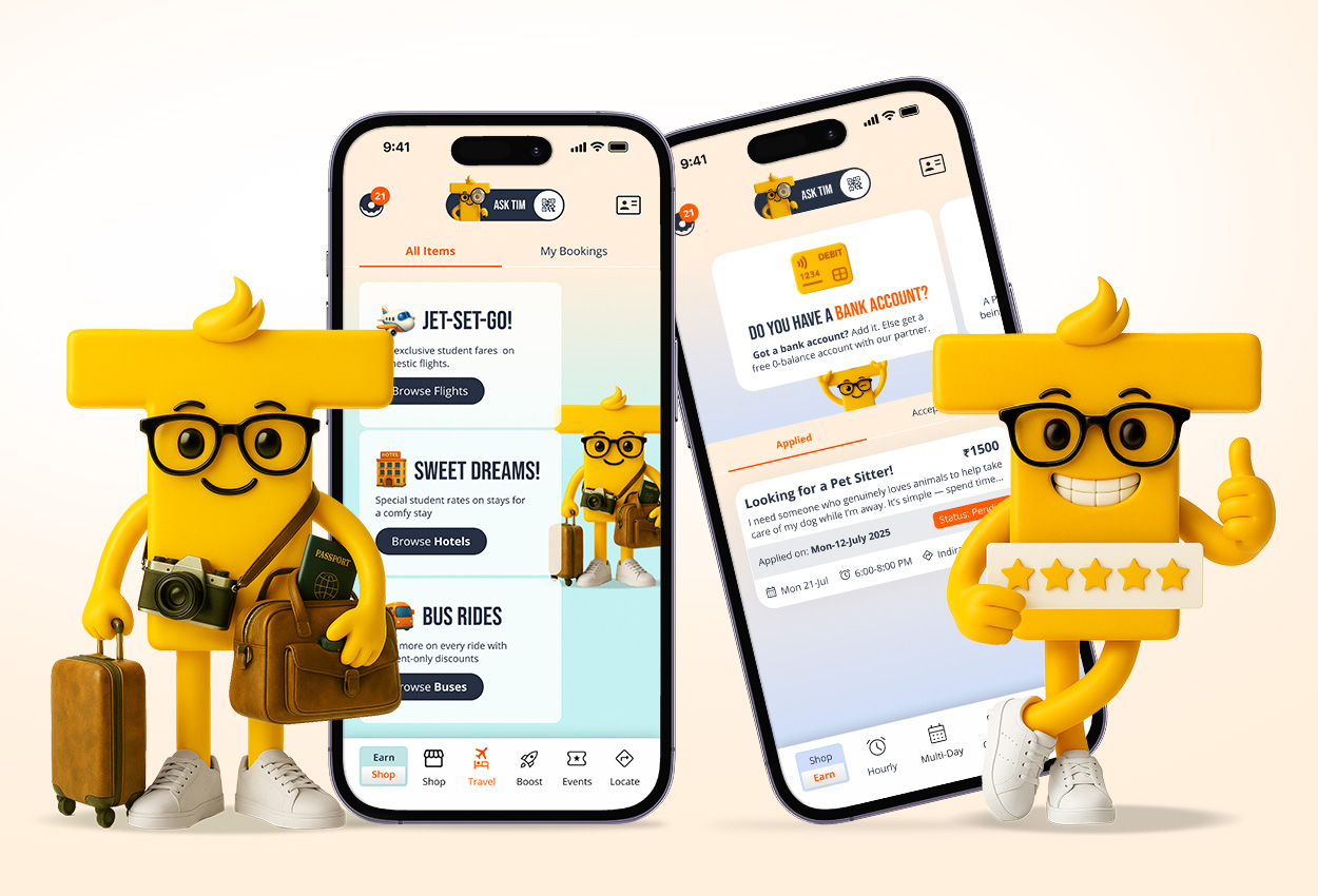
TimBuckDo brings gigs and rewards into one app. Students can earn through gigs and use rewards for perks in shopping, travel, and experiences. Locomotive, with Adi & Co, redesigned the UX to make everything feel connected, quick, and easy—while keeping Tim’s playful vibe.
Core worlds
Sections
Students on boarded
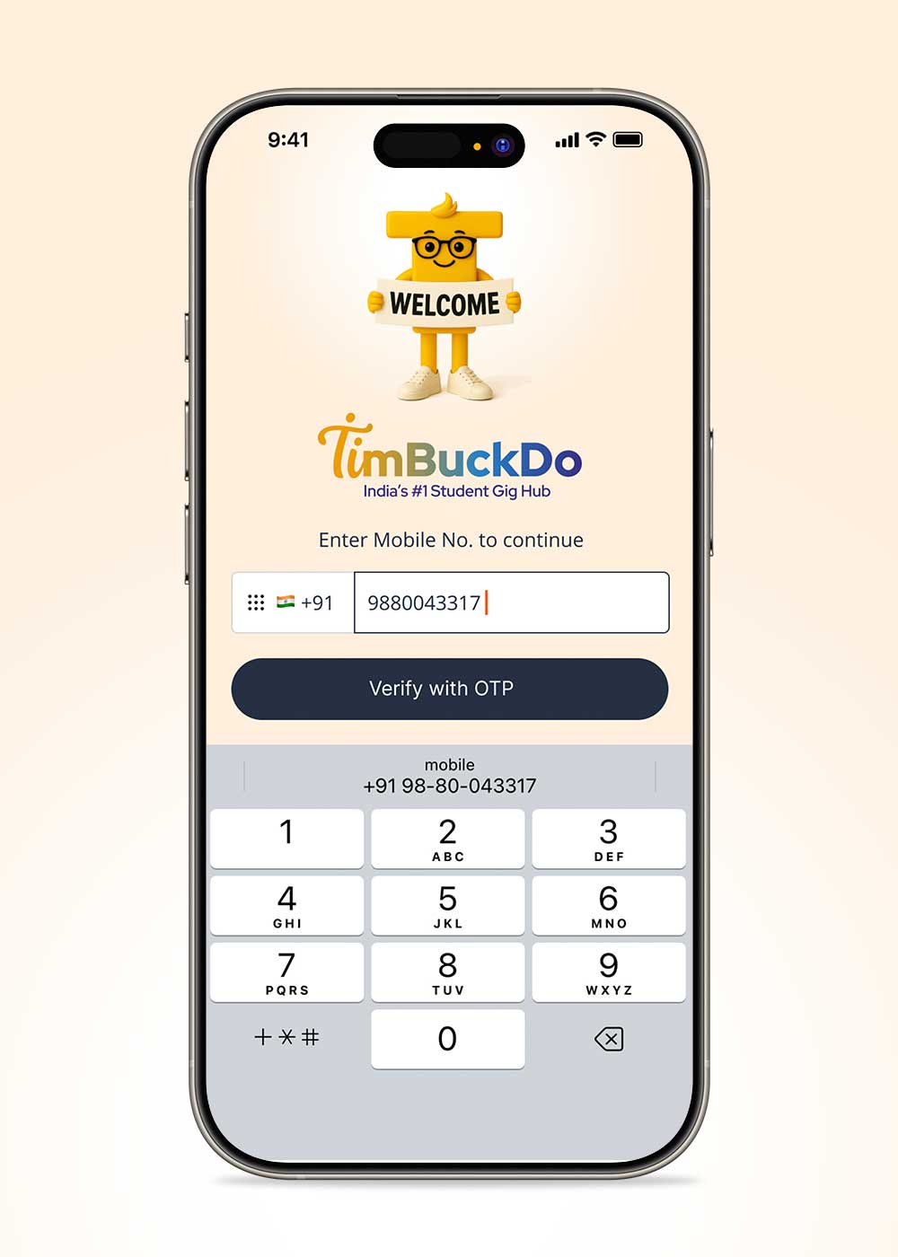
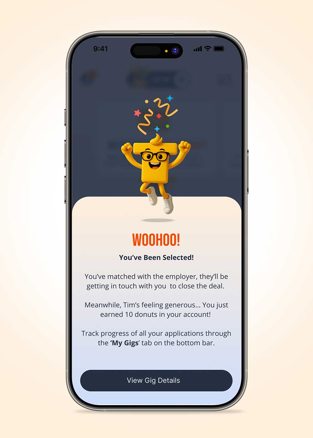
Tim was used as a consistent guide across the UI – not as decoration, but as a UX tool to add clarity, warmth, and reassurance at key moments. We placed him where users typically need a nudge: onboarding and consent screens, discovery prompts, and high-emotion states like rewards and selection, so the tone stays friendly without getting in the way of tasks.


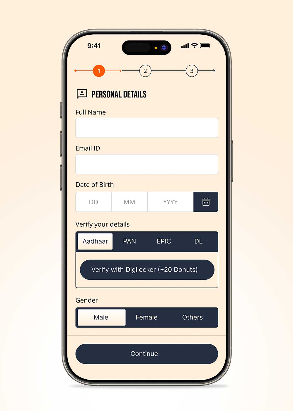
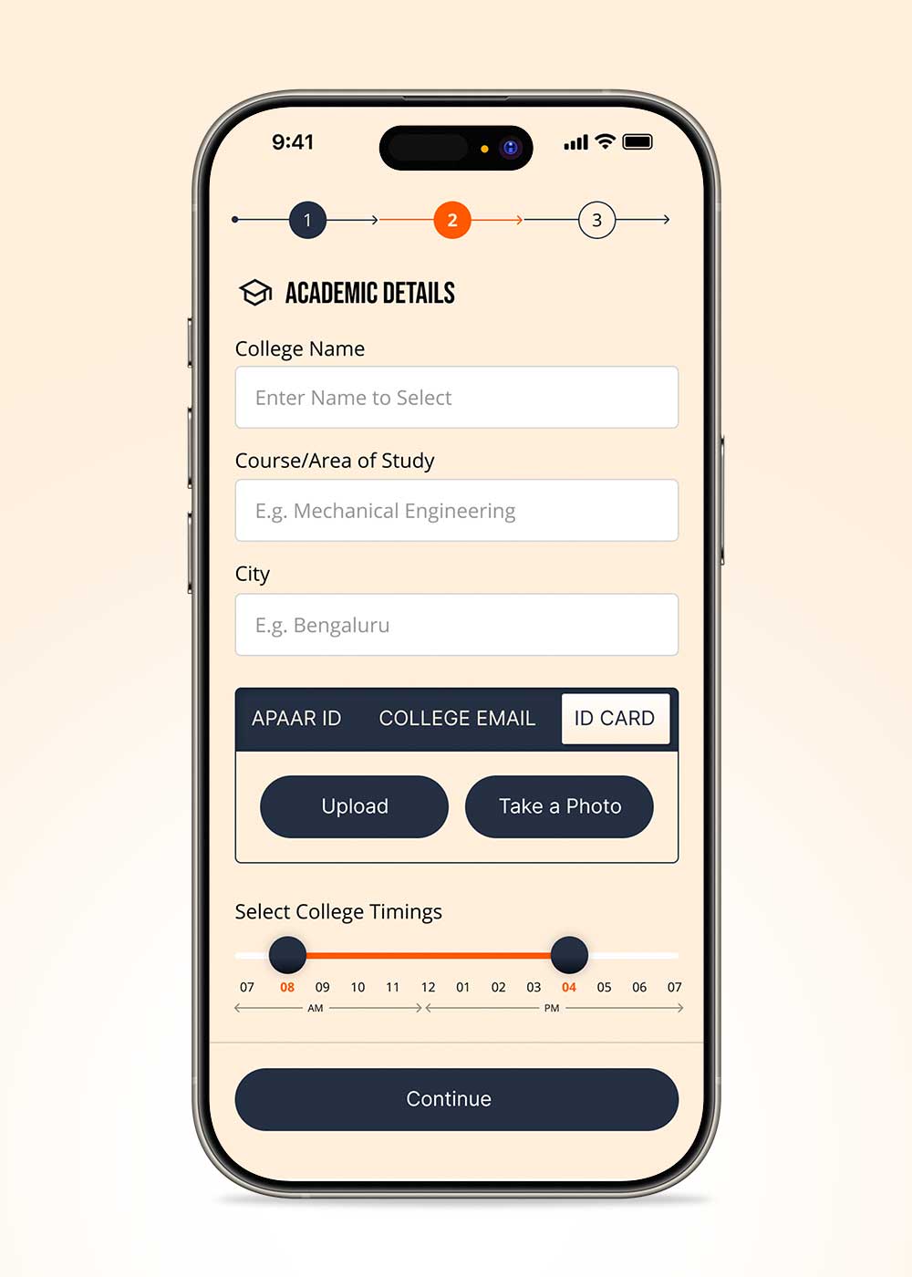
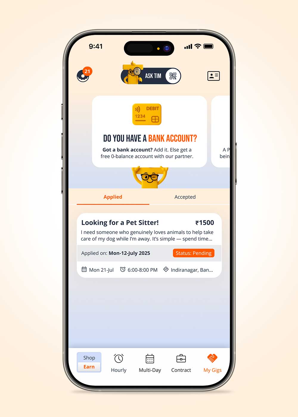
The redesign focused on giving the app a clear, repeatable structure across very different journeys—earning through gigs, tracking applications, and redeeming perks – so users always know where they are and what happens next. We built a consistent navigation spine (top actions + bottom tabs) and tightened the visual hierarchy so the experience stays fast to scan, even when the content changes by category.
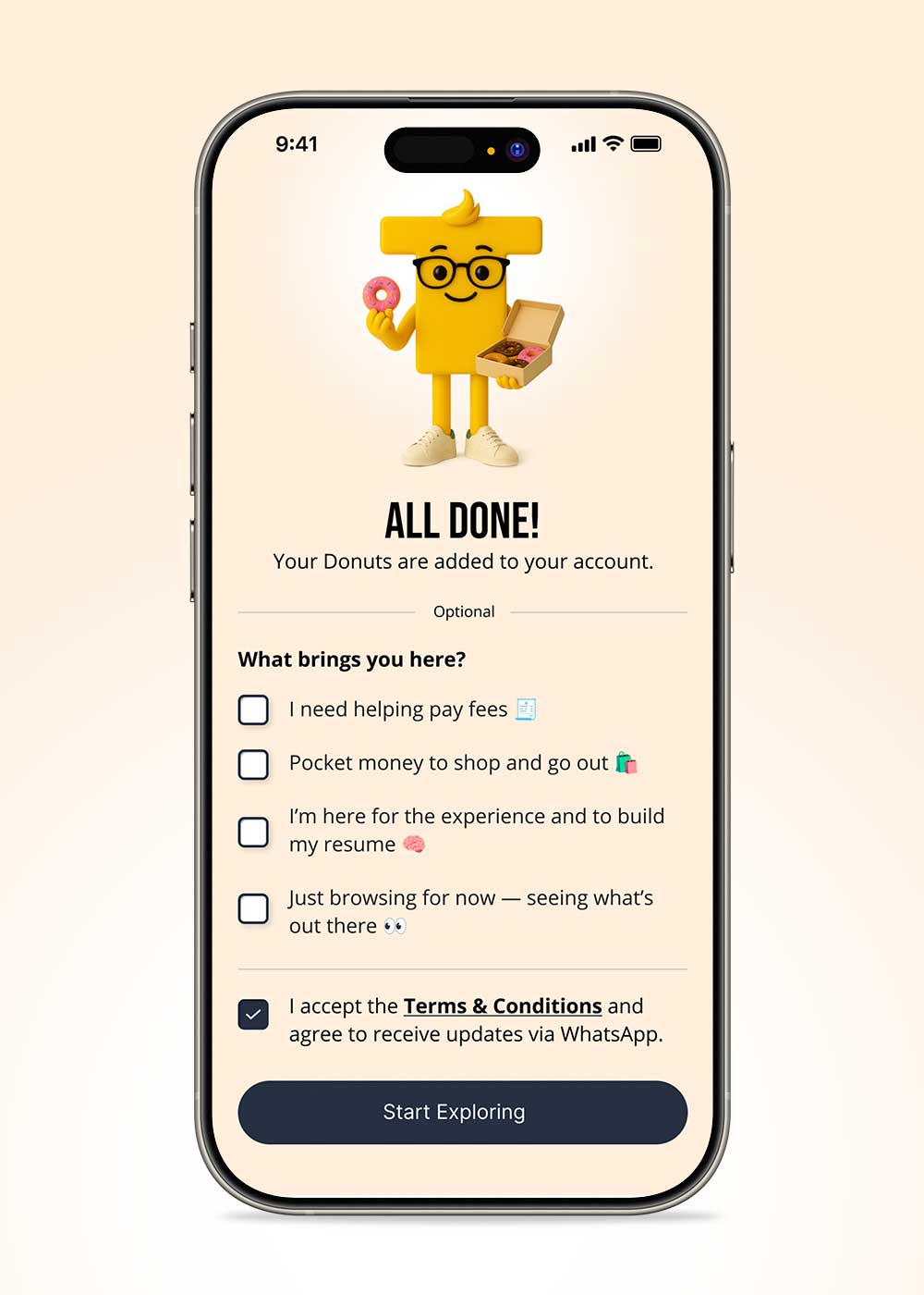
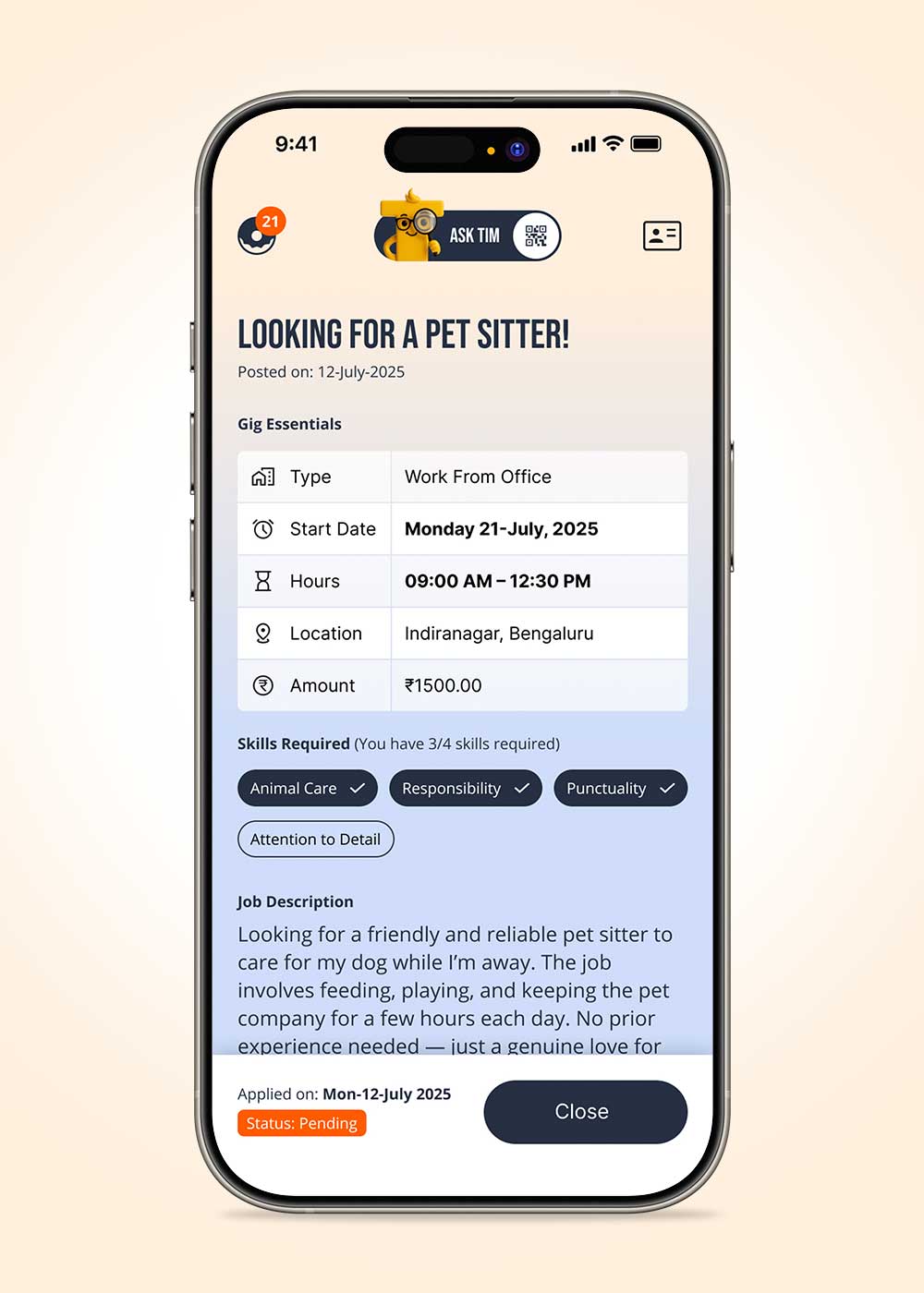
In the Earn journey, we made it easier to discover gigs and decide fast. Gig cards now show the basics first, and simple filters help users narrow options without feeling like they’re “searching.” We reduced confusion by keeping essentials upfront, requirements next, and status always visible. Tim adds energy to success and reward moments.
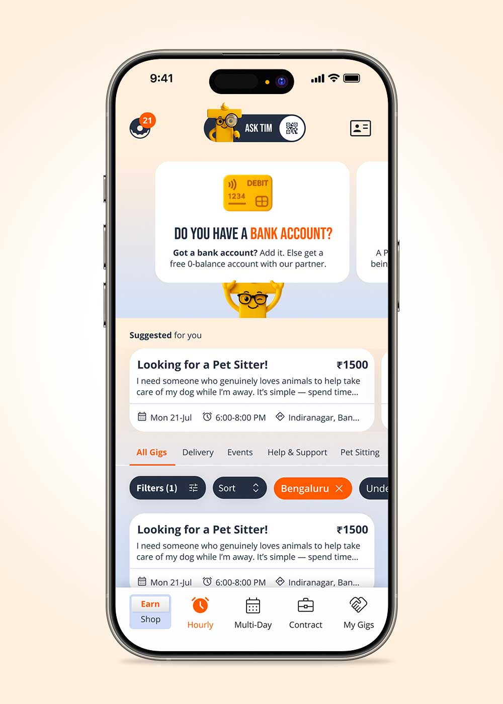
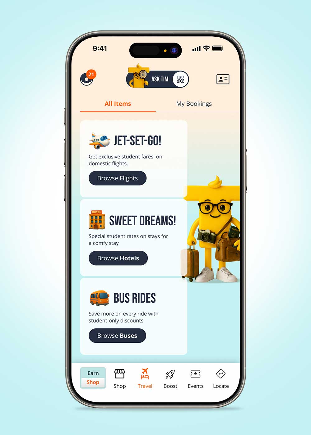
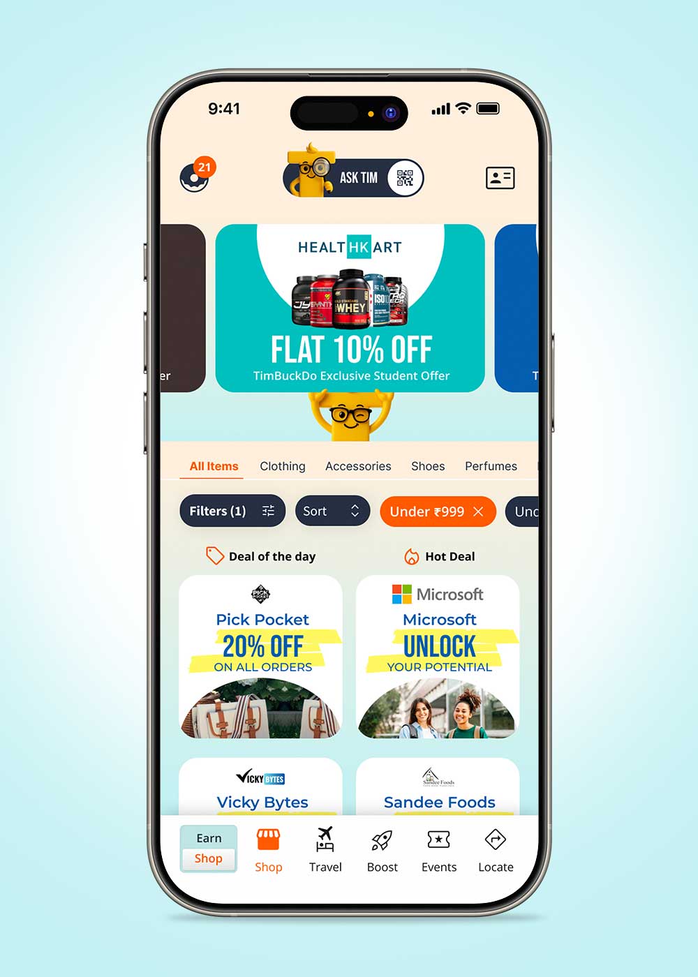
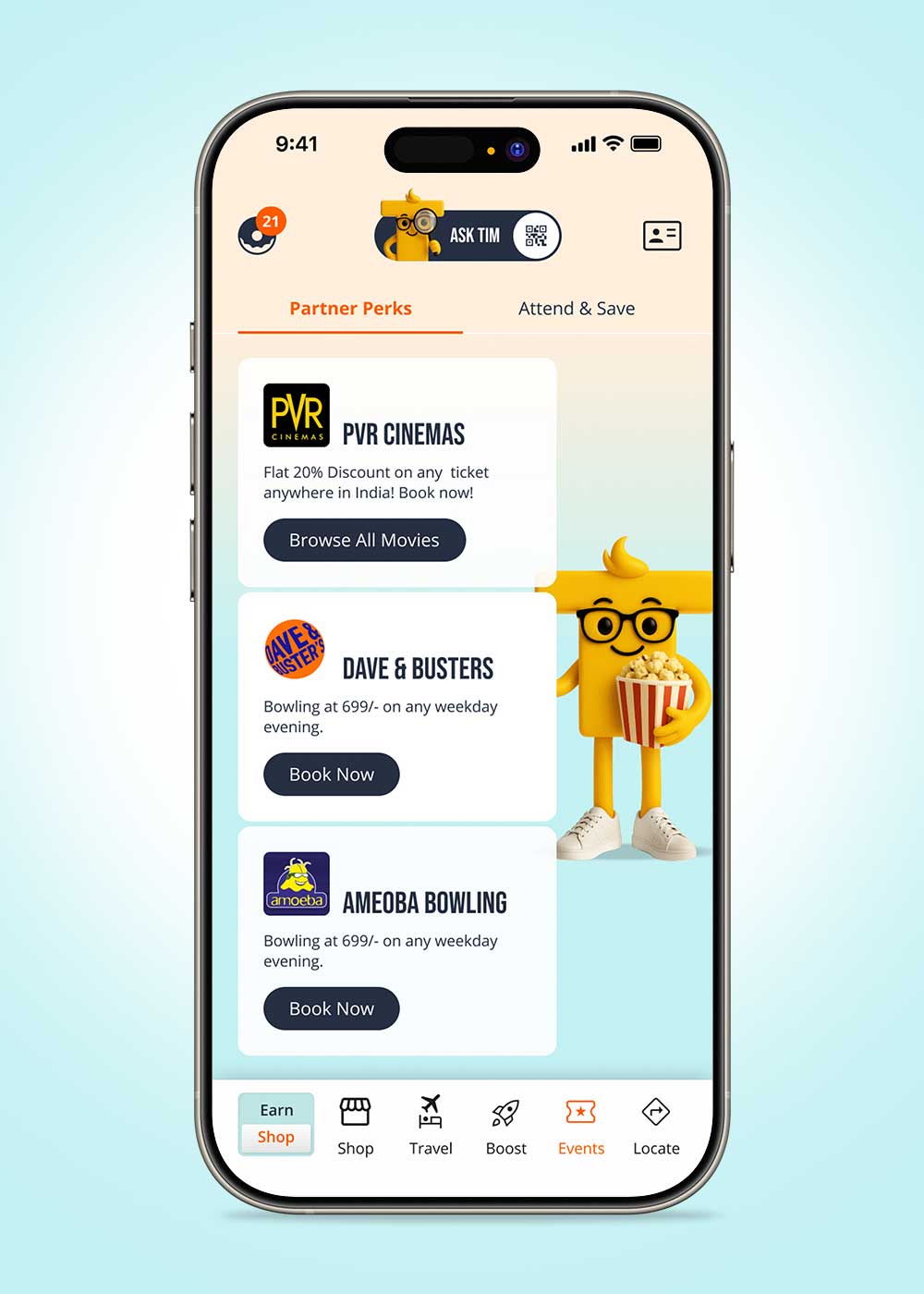
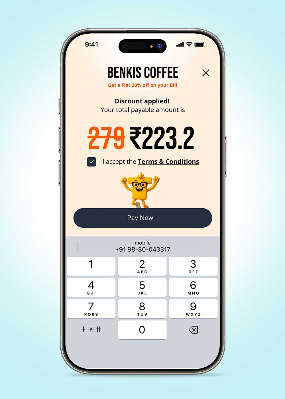
The Spend section was redesigned as a simple, student-friendly catalogue. Big offer cards and clear categories (Shop, Travel, Events, Places) help users quickly see what’s available, and each card has one clear action like Browse, Book, or Pay.